Part of my job over at Oniracom is staying on top of web design trends. This of course means that it is my official duty to cruise around the internet with no particular aim but to see what is out there. It’s a difficult job, but someone has to do it.
I was keeping my eyes on the website designs that have come out this year, when I started to realize something. These websites have some very common threads. The organizer in me decided that I must find a way to group them all.
As I started grouping them, I realized that web design right now can be boiled down to two major kinds of design and 5 styles.
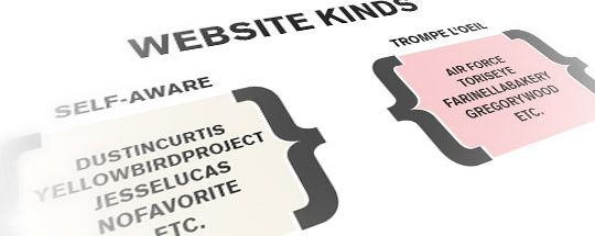
Here is how it works. There are Two Kinds of Website Design:
1) Self-Aware and 2) Trompe L’oeil.
A Self-Aware site is precisely what it sounds like. The design of the site clearly communicates that one is looking at a website. There is no trickery, no pretending to be a newspaper page. It could be referred to as “pure web design” because it is working with an entirely web basis.
The other kind of site is what I call Trompe L’oeil, which literally means “to trick the eye”. I borrow the term Trompe L’oeil from art history—in renaissance painting it was used to create the illusion of 3D images on flat canvas. Often this technique was employed by the moderately wealthy to make it appear that their house had more things in it—a painter would paint trompe l’oeil plates on teh walls, lights on the ceiling, etc.
As I use it in regards to web design, A Trompe L’oeil site design is one that is trying to lead its viewers to interact with a fictitious interface. It is trying to trick your eye into seeing and interacting with something in way that is unique from that of the standard web page This can be as dramatic as a site that puts the user in the cockpit of a plane, or as subtle as a site that pretends that it is a printed magazine. Either way, the site is trying to make its viewers think they are not looking at a digital, internet-based site. To use some buzzwords, the user interface of the site is not that of a website but is instead a fictitious interface through which the user exists and interacts with the site.
Another way to think about it is that in Self-Aware Design, the user retains his or her place outside of the site looking at a screen; In Trompe L’oeil Design, the user becomes a part of the environment created in the site (i.e. he or she is commanding a submarine or walking in a fake world or perusing a sketchbook).
Under each of these 2 Kinds of sites are 5 distinct style types:
1) Folk
2) Retro
3) Sci-Fi
4) Minimalist
5) Present
The kind of site (Self-Aware or Trompe L’oeil) decides the flavor of the style. (i.e. a site that is a Self-Aware Retro site will have distinctive qualities from a Trompe L’oeil Retro site.)
Here I thought it might be useful to give some examples of each, along with a breif description of what makes a site fall under its category and style type.
Folk
Folk site design draws from the history of folk art and handcraft. Folk designs generally incorporate a degree of Naivety, handmade elements and intuitive forms.
Trompe L’oeil Folk
Trompe L’oeil Folk incorporates folk elements while also creating a fictitious interface through which a user experiences the site. One of the most commonly used trick is creating an environment that feels like one is looking through someones sketchpad or piece of notebook paper.
Thats Not Cool
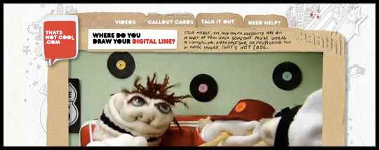
That’s not cool, with it’s cardboard, crumpled paper and hand drawn elements, invites the user back to the innocent days of childhood when friends got together and made tv’s and forts out of leftover cardboard boxes.
Odopod Sketch
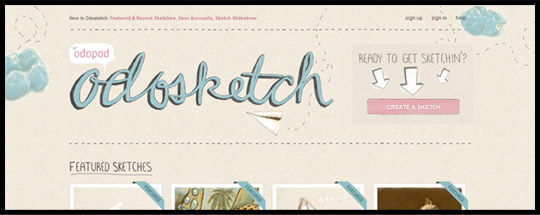
Odosketch shows an excellent version of one of the more common interface manipulations—making the website appear as a sketchbook. You can even sketch on it!
Tori’s Eye
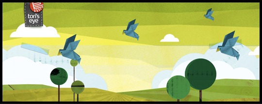
Tori’s Eye is definitely the most fun way to search twitter. In it, the user enters a field wher folded paper birds flyby with messages.
Duplos
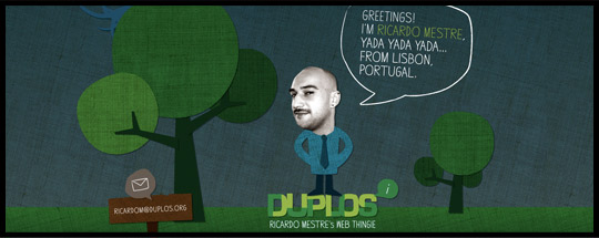
This creative portfolio invites the user into a field rich with simple, intuitive trees and burlap textures.
Self-Aware Folk
Self-Aware Folk uses handmade elements and intuitive forms as details and features on the page, but does not go so far as to create a fictitious interface for the user. It is clearly a website, but it has strong elements of Folk Art.
Contrast
Contrast steps close to being a Trompe L’oeil design, but as one scans through their site, it is apparent that this site isn’t trying to imitate anything.
Yellow Bird Project
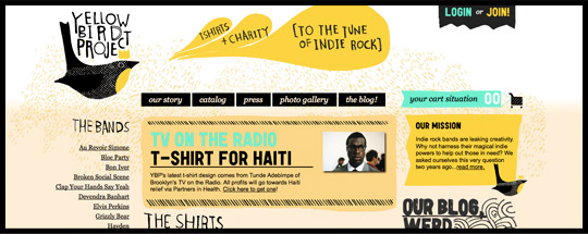
The Yellow Bird Project is the definitive Self Aware Folk site. The page is covered with fun handmade illustrations and type, which serve as decorations for a standard web interface.
Chirp
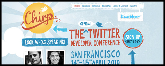
Chirp is another one that I would put up right next to The Yellow Bird Project.
Matthew Dimmett
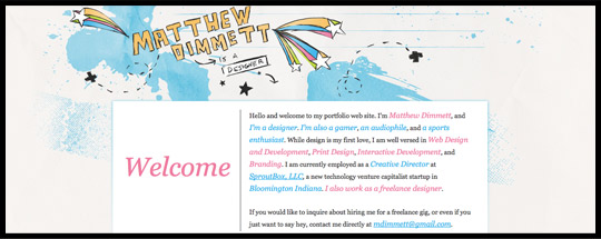
Matthew Dimmett’s header has some wonderful watercolor splashes and sketched lines which merge wonderfully into a clear and enjoyable standard user interface.
Retro
Since web design is a relatively new area of design, I’m going to use a large definition of Retro (as it is in fashion and other place, retro seems to only refers to time periods up to the 1970s). For web design, retro is design that is borrowing its style from any time period earlier than the present. This means that “grunge design” is retro design because it is clearly nineties. Sites that borrow from 1800s typography are also retro. Retro is resurrecting style and design from a past period.
Trompe L’oeil Retro
Trompe L’oeil Retro is generally the extreme end of this. They go past borrowing style from the past and go so far as to create an environment that feels like it has come out of the past.
Colly
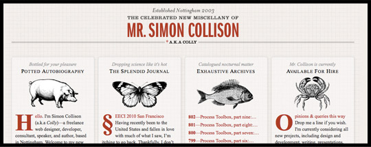
Colly’s site makes the user feel like they went back in time and picked up a newspaper from the late 1800s—The images even suggest the pecularities of lithography.
Shaun Inman
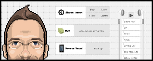
When a user goes to Shaun Inman’s site, He or she is met with the sensation of suddenly stepping straight into an 80s video game.
Farinella Bakery
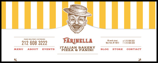
Farinella Bakery gives off the sense that one is visiting a county fair bootht in the 1950s or 60s.
Logic Bomb Media
Logic Bomb offers the interface of a person laying out his/her 1990s Comic Book Stills. The grungy concrete background and worn paper frames give it that extra retro nod.
Self-Aware Retro
Self Aware Retro is the lighter form of Retro. It borrows typography, shape and other elements from earlier decades, but it keeps the site as a whole in the present realm of web design. One is not looking at a mysterious webpage from the 1950s but instead is looking at a modern site which is giving a nod to the 1950s.
Giraffe
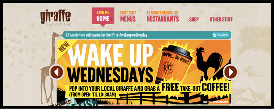
Giraffe is extremely retro, but the interface remains that of a standard website. The user is not asked to step into the site in some way.
Mix
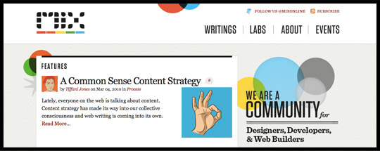
Mix is a really refreshing site. It’s soft colors and circles give a strong nod to the past.
Ride Oregon
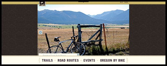
Ride Oregon’s typography, texture and tone put it back a few decades, but the user views the site from an external rather than internal point.
Curious Generation Group
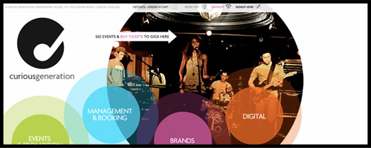
Curious Generation Group has similar elements to VisitMix.com, but with an extra jolt of energy.
Sci-Fi
Sci-Fi design is a style of design that brings in elements that seem surreal, futuristic or otherworldly. The easiest way to recognize it is if a design reminds you of a Sci-Fi movie. Sci-Fi design is far more prevalent in web design than print. Perhaps the reason is that the internet makes people feel like the future is being achieved, or perhaps it is a nod to the surreal digital lives that many people lead. Maybe it is just the kind of people that love to work in web design. I’m not sure, but Sci-Fi is here and kicking.
Trompe L’oeil Sci-Fi
Trompe L’oeil Sci-Fi creates a surreal/futuristic environment and drops the viewer into it. Here are some examples.
Michel Berger Hotel
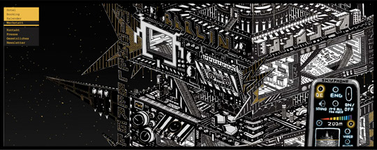
Step into a space aged cartoonish atmosphere; try controlling the environment with your skyphone.
Air Force
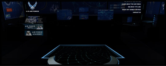
The air force site places you in a tech room that feels like it came straight out of halo.
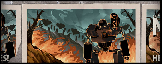
Star Trek Movie
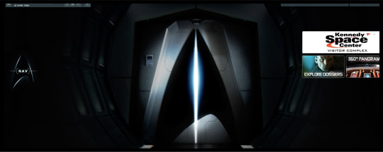
You can walk around the Starship on the latest Star Trek Movie site.
The Leviathan Chronicles
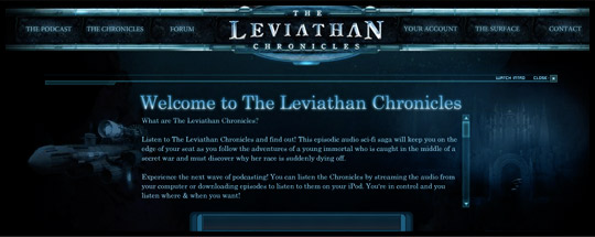
The Leviathan Chronicles site places the user at the helm of a submarine that navigates the waters as the user navigates the site.
Self-Aware Sci-Fi
Self Aware Sci-Fi places surreal/futuristic environments in front of the viewer but the viewer maintains his or her place outside of the surreal/futuristic environment.
Gavin Castleton
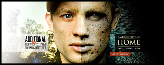
Gavin Castleton’s site features bold and surreal imagery.
Jesse Lucas
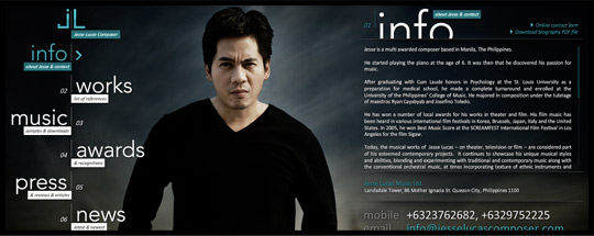
Jesse Lucas’ site feels like a futuristic take on the Million Dollar Man.
Freak Studio
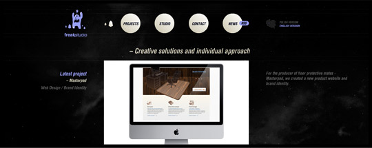
Freak studio is a little more subtle than the others, but there is a definite sense of being in the space-age.
Foehn
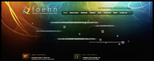
Foehn’s site, with it’s colors, gradients, forms and flying shapes make it a definite futuristic site.
Minimalist
Minimalist Design involves the removal of extra details and frills. The design cuts down to just the essentials. The idea behind it is that stripping away unnecessary details allows one to get to the pure elements that are needed to do the job.
Trompe L’oeil Minimalist
Trompe L’oeil minimalism is a bit of a challenge, and it isn’t common. The concept of minimalism generally dismisses the existence of a fictional interface. However, there are times when the style of the site is stripped back and the small elements of the site emphasized a user interface other than that of the internet. A few examples popped up.
Dustin Curtis
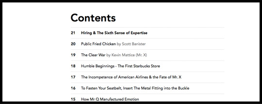
It really doesn’t get more minimal then this. Dustin Curtis turns his site into a book with a table of contents as the index.
Design Taxi
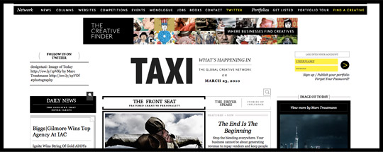
This may be hard to swallow as minimalism because of the amount of content, but content aside, the design is almost entirely typography. There really aren’t many extra stylistic elements at all, and the site gives on the sensation that they are reading a newspaper.
Helveticons
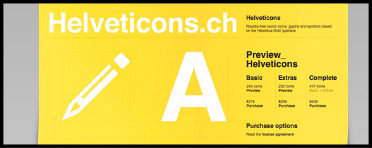
helveticons is probably the best example of Trompe L’oeil minimalism. Everything on the site is in it’s most reduced form and the site is presented to the user as an unfolded piece of paper.
Self-Aware Minimalist
Self Aware Minimalism is another one of the most prevalent forms of web design. This form of minimalism removes excess pieces to get to the core needs of the website.
Snook
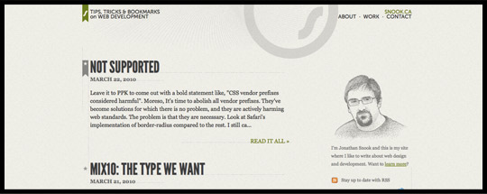
Simple layout with focus on the content is what Snook’s site is all about.
Larkef
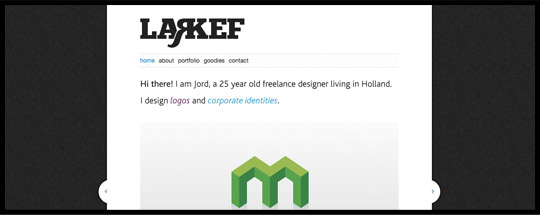
Larkef pulls back the nav and header so that the user can focus on the important parts of his website. The images in the slider and the buttons to get in contact with him.
Patrick Monkel
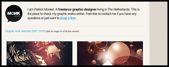
Clear focus on the thumbnail images drives Monk’s site.
No Favorite
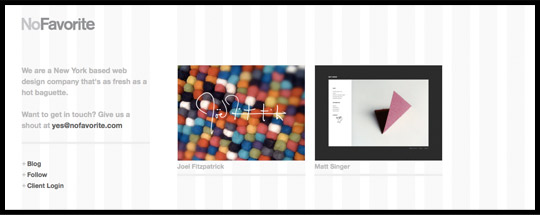
No Favorites lets their layout ability shine by making their grid the most apparent stylistic element.
Present
Present is a category that I am using to lasso in contemporary design. It may draw small elements from other time periods or folk art or things like that, but these are small parts of the overall site. A “Present” site is thorughly contemporary, it reflects present day styles and ideas. In short, it is a product of now.
Trompe L’oeil Present
Trompe L’oeil Present design exists when there the site employs a fictitious user interface drawn from some an area of life that is contemporary but not typically part of web design.
Dustin Curtis Articles
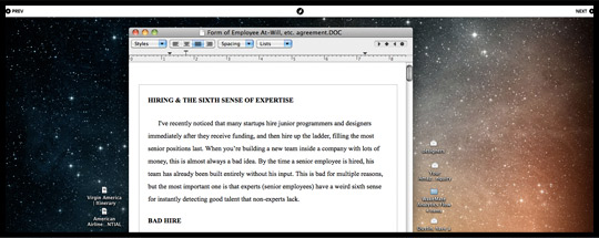
Dustin Curtis’ articles invite the user into the experience of leafing through a printed magazine.
Knight: Liquidity
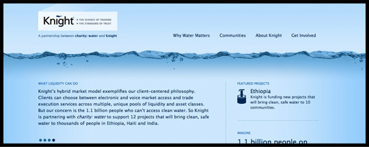
The user is submerged in water on Knight’s Liquidity Site.
Swiths
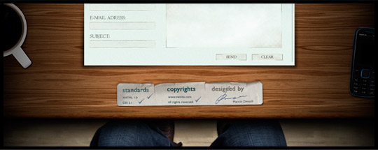
Swiths invites the user to take a seat at a nice wooden desk.
Gregory Wood
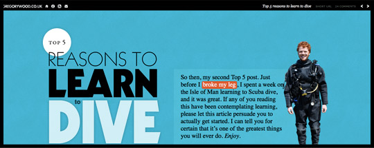
Gregory Wood’s site is another one that offers users the sensation of reading a printed magazine.
Self-Aware Present
These are basic, solid sites. They employ the latest techniques and styles and always retain a standard relationship between the site and the user.
Otis College of Art and Design
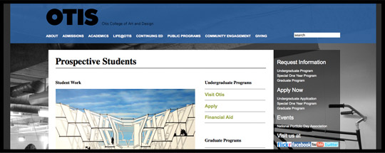
Large photos and color changes for each page of the site make Otis.edu an enjoyable site to check out.
Eight Interactive
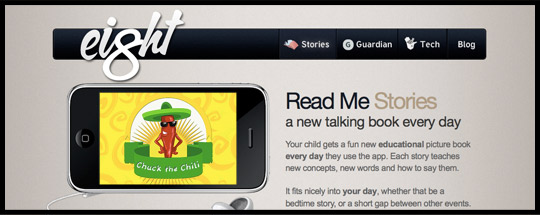
Eight Interactive is one of those sites that can be seen as a direct descendant and embellishment of what I term the “Apple Design Aesthetic.”
Charles Selena
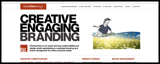
Bold Typography and bright red flowing transitions make Charles Selena’s site an exciting contemporary place.
Rob Alan
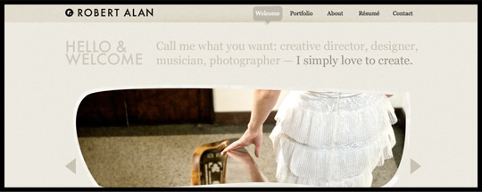
Rob Alon has a more subtle approach with hints of retro and folk, but overall keeps up a contemporary feel on his site.
Tap Bots
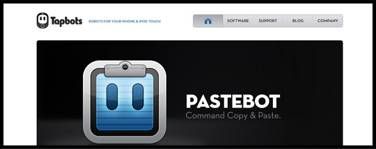
Tapbots is an even more direct result of the “Apple Design Aesthetic,” and why not? It is made to work with Apple productsl.
Slidedeck
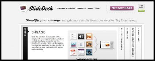
Slidedeck employs some of the most loved contemporary web techniques. A large content slider and mock-letterpress titles.
There you have it. Two kinds of sites and 5 Styles.
Do you know any sites that fit as better examples or sites that you think don’t fit anywhere in this grouping? Please, leave a comment with your thoughts and questions.